
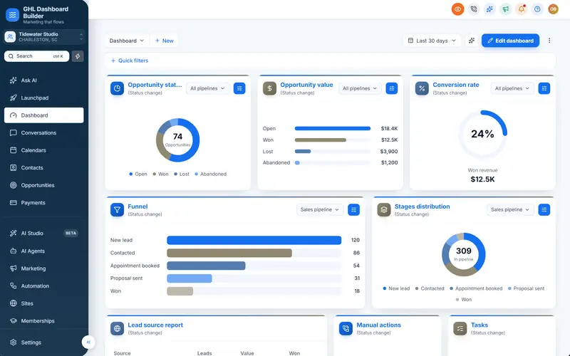
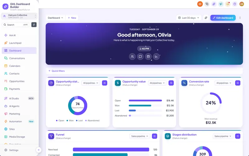
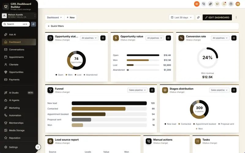
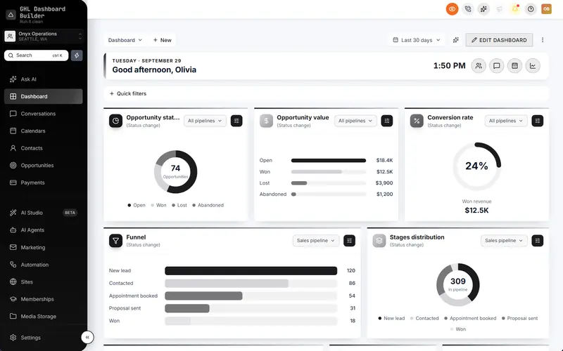
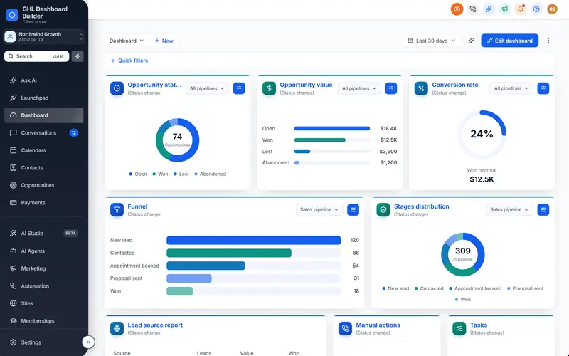
Your clients open the same left-hand menu every working day. In a standard account it has HighLevel’s colors, HighLevel’s icons and HighLevel’s layout, so even with your logo at the top it still looks like someone else’s product. Agency owners ask the same thing in different words: “Can I change the sidebar color?”, “Can the menu go across the top?”, “Why do the icons look the same in every agency’s account?”
This guide answers those questions for GoHighLevel sidebar customization. It covers what HighLevel (also called GoHighLevel or GHL) lets you change in its own settings, what needs custom code, how to choose colors and icons that stay readable, when a top navigation bar is the better choice, and how hover menus work. It then shows how GHL Dashboard Builder handles each part, which plan includes it, how it installs, and the limits you should know before you promise a client a new menu.
Can you customize the GoHighLevel sidebar?
Yes, in two layers. HighLevel’s own settings change the logo, add custom menu links, rename Contacts and Opportunities, and control what each user may open. Everything visual (the sidebar’s colors, highlight, icon style, hover menus and a top bar) is changed with custom CSS and JavaScript in the agency’s Custom Code settings.
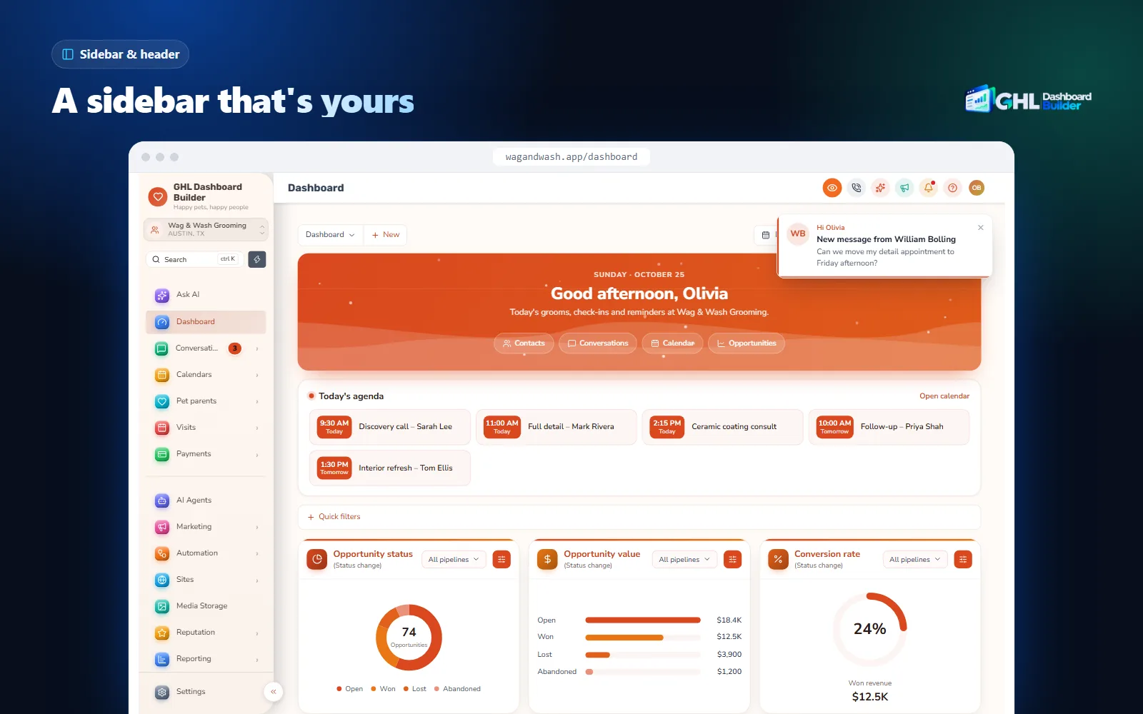
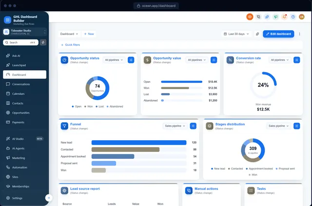
The sidebar is the vertical menu on the left of every sub-account (one client’s workspace, which HighLevel also calls a location) and of the agency view. In the sub-account it holds HighLevel’s main modules: Dashboard, Conversations, Calendars, Contacts, Opportunities, Payments, Marketing, Automation, Sites and the rest, with Settings at the bottom. At the time of writing, the sub-account switcher and a search box sit at the top of it.
The first layer is built in and costs nothing extra. The second layer depends on the agency settings: HighLevel’s agency settings article describes a Whitelabel tab with a Custom Code area for CSS and JavaScript that changes how the agency dashboard looks and works. Code added there applies to the HighLevel interface your users see, including every sub-account view.
Keep one distinction in mind through the rest of this guide. HighLevel’s settings change what the menu contains and who can open what. Custom code changes how the menu looks and, with JavaScript, what it says and where it sits. You usually need both.
What can HighLevel’s own settings change in the sidebar?
Four built-in settings touch the sidebar: the agency logo, custom menu links, the names of two standard objects, and user permissions. None of them changes the sidebar’s colors, icons or layout. Set them up first, because a theme builds on them rather than replacing them.
The agency logo
Your logo goes in the agency’s company and white-label settings. It appears at the top of the sidebar and in other places HighLevel shows your brand, such as emails and the white-label login page. Upload it there even if a theme also places a logo in the sidebar, so the rest of the platform matches.
Custom menu links
HighLevel’s guide to custom menu links explains how an agency adds its own items to the agency or sub-account sidebar. Each link can open a page embedded inside HighLevel, in a new browser tab or in the current tab, and can be limited by role. Agencies use them for a help center, a booking page for support calls, a reporting tool or a client portal.
Renaming Contacts and Opportunities
HighLevel lets a sub-account admin rename standard objects such as Contacts and Opportunities, with a singular and a plural name. This is set one sub-account at a time and covers those objects only. The other menu items keep HighLevel’s names.
User permissions
HighLevel’s article on sub-account user roles, permissions and assigned data explains the Admin and User roles and module-by-module access. When a user has no access to a module, that module is not useful in their menu. Permissions are the right tool for “this person must not open Payments”; a theme is the right tool for “nobody at this clinic needs to see Reputation in the menu”.
Steps: set up the built-in layer first
Menu names move from time to time, so check the linked help articles if your screen looks different.
- Upload your logo. In the agency view, open Settings, Company and the white-label options, and upload the logo and favicon.
- Add custom menu links. In the agency view, open Settings, Custom Menu Links, choose Create New, enter the name, the URL and how it opens, and choose which sub-accounts and roles see it.
- Rename objects where it matters. Inside a client’s sub-account, open Settings, Objects and rename Contacts or Opportunities, for example to Patients or Jobs.
- Set permissions. Inside the sub-account, open Settings, My Staff, edit each user and switch off the modules they don’t need.
- Look at the menu as a client user. Sign in as a test user with the User role and note what they see. That is the menu your theme will style.
What does GoHighLevel sidebar customization cover?
Sidebar customization covers six things: colors, the logo, menu icons, the menu’s wording and order, the navigation layout (sidebar or top bar) and the extras that make the menu faster to use, such as hover menus and favourites. HighLevel’s settings handle a small part; custom CSS handles the look; JavaScript handles words, order and layout.
The table maps each part of the sidebar to the tool that changes it. Use it to decide what you can do yourself and what needs code.
| Part of the sidebar | HighLevel’s own settings | Custom CSS | Custom JavaScript |
|---|---|---|---|
| Logo at the top | Yes, agency logo | Size and spacing | Not needed |
| Background, text and highlight colors | No | Yes | Not needed |
| Menu icon color and frame | No | Yes, within limits | Not needed |
| Renaming Contacts and Opportunities | Yes, per sub-account | No | Yes, everywhere |
| Renaming other items (Calendars, Sites, Reputation) | No | No | Yes |
| Reordering items | No | Visually, fragile | Yes |
| Hiding items | Through permissions | Yes, visually | Yes |
| Your own links | Yes, custom menu links | Styling only | Placement |
| Hover menus listing every page | No | No | Yes |
| Menu across the top of the screen | No | Partly | Yes |
| Live counts next to items | No | No | Yes |
Two rows deserve a comment. Hiding with CSS only removes an item from view, so a user who knows the address can still open the page; that is why permissions matter. And renaming is a JavaScript job, not a CSS one, because CSS cannot reliably replace the text inside HighLevel’s menu. Our guide to renaming GoHighLevel menu items covers the wording side in depth; this guide concentrates on the look and the layout.
If you are mapping the whole dashboard, not just the menu, our overview of GoHighLevel dashboard customization covers the Dashboard page, the pipeline board and the login page as well.
How does GHL Dashboard Builder customize the GoHighLevel sidebar?
GHL Dashboard Builder is an independent design service that turns the standard HighLevel (GoHighLevel) dashboard into a branded platform: your colors, menu, login design, privacy mode and your clients’ language, installed with two lines of code. For the sidebar, it restyles HighLevel’s own menu in your colors, with your icon style, and adds hover menus, a top bar and a menu editor.
The service is not affiliated with HighLevel. It works through the same Custom Code settings described above, so it restyles the menu HighLevel already renders rather than replacing it. Links, permissions and custom menu links keep working the way HighLevel built them.
The sidebar features at a glance, and the plan that includes each
| Feature | What it does for your clients | Plan |
|---|---|---|
| Sidebar, menu highlight and header colors | The menu in your brand colors, with rounded highlights on the active item | Starter and up |
| Logo in the sidebar | Your logo at the top of the menu in small, medium or large | Starter and up |
| Menu icon styles | Native, brand color, multicolor, flat tiles or glossy 3D tiles, in three sizes | Starter and up |
| Branded sub-account switcher | The switcher and its dropdown in your menu colors, with a location badge | Starter and up |
| Settings Go Back button | The button that leaves Settings shown as a pill in your highlight color | Starter and up |
| Collapsed icon rail | HighLevel’s collapsed menu with the icons lined up as tiles | Starter and up |
| Hover menus | Hovering a section lists every page in it, with a second column for sub-pages | Pro |
| Top navigation | The menu in a bar across the top, a More menu and a Settings mega menu | Pro |
| Menu editor | Rename, reorder and hide any of the 19 menu items, New and Beta labels, your own items | Pro |
| Live menu counts and favourites | Unread conversations and other counts on the menu; a star that pins pages to the top | Pro |
| Single sub-account | The sidebar design shown only in the sub-accounts you choose | Starter and up |
Every one of the 18 features, with what installs and what is preview-only, is listed on the features page. The commercial overview of this topic, with examples, lives on our GHL sidebar and menu customization page.
How it installs
You design the sidebar in the free builder on a live copy of HighLevel’s screens, on desktop, tablet and phone. After you choose a plan, we install it for you as part of the one-time $100 setup fee: one CSS line goes into Custom CSS and one JavaScript line into Custom JavaScript under Settings, Company, Whitelabel, Custom Code, and we check every screen. It takes about 5 minutes. To remove it, clear both boxes.
What your clients see afterwards
A client signs in on your white-label domain and sees a menu in your colors, with your logo, your icon style and a highlight that matches your buttons. On Pro, hovering Marketing lists its pages so they can jump straight to Emails or Social Planner, and the menu uses their words, such as Patients or Jobs. HighLevel’s features work exactly as before; the theme changes how the menu looks and what it says, not what it does.
The fastest way to get there is to start from a finished design. The 27 templates each come with sidebar colors and an icon style already balanced; the Roofline template, for example, pairs a dark menu with home-service wording.
How do you choose GoHighLevel sidebar colors that stay readable?
Choose four colors that work together: the sidebar background, the menu text, the hover text and the active highlight. Then test them against contrast rules, not just your logo. The W3C’s WCAG guidance asks for at least 4.5 to 1 between normal text and its background, and 3 to 1 for icons and controls people need to see.
Why contrast matters more in a sidebar
Menu labels are small text, and people read them many times a day. A brand color that looks fine on a logo can be hard to read as a background behind small white text. The W3C’s Contrast (Minimum) criterion sets 4.5 to 1 for normal text and 3 to 1 for large text. The Non-text Contrast criterion asks for 3 to 1 for the visual parts of controls and graphics that people need to understand, which includes menu icons and the active-item marker.
Menu labels are normal-size text, so 4.5 to 1 is the level to aim for. Enhanced (AAA) is optional. Source: W3C, Understanding WCAG 2.2: Contrast (Minimum), Non-text Contrast and Contrast (Enhanced)
A four-color recipe that works
- Sidebar background. Pick a deep version of your brand color or a near-neutral (very dark navy, charcoal, or a white or light grey for a light menu). Deep colors carry white text well.
- Menu text. White or near-white on a dark menu; a dark grey on a light menu. Check it against the background for 4.5 to 1.
- Hover text. Leave it the same as the menu text, or brighten it slightly. A hover color that drops contrast makes the menu feel broken.
- Active highlight. Use your primary brand color behind the active item, with text that passes 4.5 to 1 against that highlight, not against the sidebar.
Don’t rely on color alone to show which page is open. The W3C’s guidance on use of color says color should not be the only visual means of conveying information, so keep a shape as well: a filled pill, a bar or a bold label on the active item.
Dark sidebar, light pages
HighLevel has no dark mode at the time of writing. A theme can make the sidebar dark, but HighLevel’s pages stay light. Most agencies find a dark menu with light pages easy to read and close to how many business tools look, but don’t sell a client “dark mode”: the content area stays light.
In GHL Dashboard Builder you set the sidebar, menu text, hover text and active colors separately on every plan, and the live preview shows every screen in those colors before you buy. If a color fails, change it in the builder and look again; nothing reaches your HighLevel until the design is installed.
Which menu icon style should you use in GoHighLevel?
Use HighLevel’s native icons recolored to your menu text for a quiet, professional look; brand-colored or multicolor icons when clients need to find items quickly; and tiles or 3D tiles when the brand is playful or premium. Whatever you choose, HighLevel’s icon shapes stay; a theme changes their color, frame and size.
What a theme can and cannot do with icons
HighLevel draws its menu icons as images. That shapes what is possible: a theme can tint an image, dim it, put it on a colored square and scale it, but it cannot redraw the shape inside it. This is why GHL Dashboard Builder offers styles built around HighLevel’s icons rather than a new icon set, and why the custom icons, icon weights and icon containers you can try in the builder’s studio are preview-only and not installed.
| Icon style | What it looks like | Best for | Watch out for |
|---|---|---|---|
| Native | HighLevel’s icons in the menu text color | Professional services, law, finance, a calm interface | Looks closest to standard HighLevel, so colors and logo carry the brand |
| Brand color | Every icon in your highlight color | Strong single-color brands | The icon color must reach 3 to 1 against the sidebar |
| Multicolor | Each menu item its own color | Teams that scan the menu by color, busy front desks | Never let color be the only cue; keep labels visible |
| Tiles | White icons on flat colored squares | Modern, app-like brands | Tiles take more room; use the small or medium size |
| 3D tiles | White icons on glossy gradient squares with a soft shadow | Premium, consumer-facing brands such as spas or detailers | The strongest look; test it on a laptop screen before choosing |
All five styles come in small, medium and large and are included on every plan. Labels stay visible beside the icons in the expanded sidebar, which keeps the menu usable for people who don’t recognize an icon.
The logo at the top of the menu
The logo is the other image in the sidebar. HighLevel’s own logo area is 40 pixels tall at the time of writing; GHL Dashboard Builder offers three sizes around it.
Source: GHL Dashboard Builder logo sizes, October 2026 (HighLevel's own sidebar logo is 40px tall)
Wide wordmarks read best at small or medium; square marks can go large. Host the logo as an image link (an https address) rather than uploading it into the design, because an embedded image makes the install code larger.
Should you use a sidebar or top navigation in GoHighLevel?
Keep the sidebar for most clients: HighLevel has many modules, and a vertical menu shows them all at once. Choose top navigation when a client uses only a handful of modules, wants more room for wide screens such as the pipeline board, or expects the look of a website-style app.
The Nielsen Norman Group’s guidance on vertical navigation explains the trade-off: a vertical menu scales well when there are many sections and room to grow, but it takes more space than a horizontal one. A HighLevel sub-account has 19 standard menu items at the time of writing, which is why HighLevel uses a sidebar. Top navigation works when you trim that list.
How top navigation works in GHL Dashboard Builder
From the Pro plan, top navigation moves the sub-account menu into a bar across the top of the screen. Items that don’t fit move into a More menu, and Settings opens a mega menu of HighLevel’s settings pages. Two limits apply at the time of writing:
- It applies to sub-account pages on screens 1024 pixels and wider. On smaller screens HighLevel’s sidebar menu is shown, because a bar of items does not fit a phone.
- Inside Settings, HighLevel’s own settings sidebar is shown, so people keep the full list of settings pages.
| Question | Sidebar | Top navigation |
|---|---|---|
| How many modules does the client use? | Many, or growing | Five to eight |
| Screen size most of the team uses | Any | Laptops and desktops, 1024 px and wider |
| Pages that need width (pipeline, calendars) | Fine with the menu collapsed | More room by default |
| Client expects | A CRM-style app | A website-style app |
| Works with hover menus | Yes | Yes |
| Plan in GHL Dashboard Builder | Starter and up | Pro |
Steps: test top navigation before you choose
- Open the free builder and pick the template closest to the client’s brand.
- Switch the layout to top navigation and hide the modules the client does not use, so the bar holds the important ones.
- Look at the preview on desktop and on tablet width. If key items fall into More on a typical laptop, trim the menu or keep the sidebar.
- Open the Settings view in the preview and check the client’s admins can still find what they need.
How do hover menus work in the GoHighLevel sidebar?
A hover menu (also called a flyout) opens when you point at a menu item and lists every page inside that section. HighLevel doesn’t offer one natively at the time of writing; you open a module and then pick a tab. GHL Dashboard Builder adds hover menus from the Pro plan, in the sidebar or the top bar.
Why they save clicks
Many HighLevel modules hold several pages behind one menu item. At the time of writing, Marketing holds pages such as Social Planner and Emails, and Sites holds Funnels, Websites, Forms and more. Without a hover menu, reaching a page means a click to open the module, waiting for it to load, then a click on the tab. With a hover menu, the page is one click from anywhere.
The page lists in GHL Dashboard Builder’s hover menus mirror HighLevel’s own module tabs and settings menu, recorded from a live sub-account. Where a page has sub-pages, a second column shows them. Settings gets a mega menu, so a client admin can jump to Business Profile, Staff or Integrations without scrolling HighLevel’s settings list.
When to switch them off
Hover menus suit experienced users who move around a lot, such as your account managers and busy front desks. For a client team that uses two or three pages, they add little; keep the menu short instead. Hover menus are part of the design, so the choice applies to everyone who sees that design.
How do you rename, reorder and hide items in the GoHighLevel sidebar?
HighLevel’s settings rename only Contacts and Opportunities, per sub-account, and hide modules only through permissions. Renaming any other item, putting the client’s most-used items first and hiding the rest for everyone needs JavaScript. GHL Dashboard Builder’s menu editor does all three from the Pro plan.
What a good menu edit looks like
- Use the client’s words. A clinic sees Patients and Treatments, a roofer sees Jobs, a gym sees Members. Our rename guide has a table of wording by industry.
- Put daily items first. Conversations, Calendars and the main pipeline usually belong at the top; Reputation and Reporting can sit lower.
- Hide what nobody uses, and say so. Hiding is visual: anyone with the address can still open the page. Pair it with permissions when access matters.
- Never hide Settings for admins. If you hide Settings from the menu, make sure agency admins can still reach it, for example by a direct link.
- Add your own items for custom objects. A dealership with a Vehicles custom object can see Vehicles in the menu, placed after the item you choose.
Badges, counts and favourites
The menu editor also adds New and Beta labels, live counts (unread conversations, appointments today, tasks due, new opportunities and overdue invoices, read from HighLevel itself) and favourites: a star in the header that pins any page to the top of the menu for each person. In the builder you can also set sample count badges for the preview; those samples are not installed, so for Conversations choose the live unread count instead.
How do you customize the GoHighLevel sidebar with custom CSS by hand?
Write a stylesheet that targets HighLevel’s sidebar, set your colors as custom properties, paste it into Custom CSS under Settings, Company, Whitelabel, Custom Code, and check every screen. It works for colors and spacing. Renames, order, hover menus and a top bar need JavaScript, which is more work to keep running.
Steps
- Inspect the sidebar. In a sub-account, right-click a menu item and choose Inspect in your browser. At the time of writing, HighLevel’s sidebar sits in an element with the id
sidebar-v2, and each menu link has an id beginningsb_. Check this yourself; HighLevel can change it. - Define your colors once. Put the sidebar background, text, hover and active colors in custom properties at the top of the stylesheet, so a later brand change is one edit.
- Write short rules. Target the sidebar container and its links. Avoid long chains such as
div > div > divand anything withnth-child, which break first when HighLevel changes its markup. - Handle the icons. Because the icons are images, use a CSS filter (for example brightness) to light or darken them to match the text. Coloring them precisely is harder than it looks.
- Test on a staging sub-account. Agency Custom Code applies to every sub-account at once, so test with a client-like user before your clients see it, and keep a copy of the previous version to roll back.
A minimal starting point looks like this. It is an example to adapt, not a finished theme:
/* Sidebar brand colors: edit these four values only */
:root {
  --side-bg: #0F172A;      /* sidebar background */
  --side-text: #E2E8F0;    /* menu text, passes 4.5:1 on --side-bg */
  --side-active: #2563EB;  /* active item highlight */
  --side-active-text: #FFFFFF;
}

/* Check the selectors in your own account first: HighLevel can change them */
#sidebar-v2 { background: var(--side-bg) !important; }
#sidebar-v2 nav a { color: var(--side-text) !important; }
#sidebar-v2 nav a.active {
  background: var(--side-active) !important;
  color: var(--side-active-text) !important;
}
Our complete guide to HighLevel custom CSS explains selectors that survive updates, specificity and a release-day routine. If you write your own code, keep it in version control and note the date you last checked each selector.
Where the hand-written route gets hard
A sidebar is one of the busiest parts of HighLevel. The same menu appears in the agency view, in sub-accounts, collapsed and expanded, inside Settings, and in different languages. Hover colors, the sub-account switcher dropdown, the collapse button and the scroll area each need their own rules. Getting a first version working is the easy part; keeping it right through HighLevel’s updates is the real cost.
Can one client have a different GoHighLevel sidebar?
Not with HighLevel’s settings alone: agency Custom Code applies to every sub-account, and HighLevel’s ideas board carries a request for per sub-account customization of colors, CSS and JavaScript. GHL Dashboard Builder can limit a design to the sub-accounts you choose, from the same single install.
How it works
In the builder or your account dashboard, choose Only these sub-accounts and add each one by pasting its link or its Location ID. Those sub-accounts get the new sidebar; your other sub-accounts and the agency view stay plain HighLevel. You can add or remove sub-accounts any time without reinstalling.
When to use it
- A pilot. Try a branded sidebar with one friendly client before rolling it out to everyone.
- A premium tier. Offer a branded platform as part of a higher-priced package, and apply the design only to the clients who pay for it.
- One very different client. A client in another language, such as Arabic with the menu on the right, can have a design that covers only their sub-account.
One design is shown in those sub-accounts. If you want several different looks for different clients, talk to us about your setup first, so we can recommend the right plan and arrangement. Our guide to GoHighLevel sub-account branding walks through the per-client options in more detail.
Right-to-left sidebars
For Arabic, Urdu and Hebrew, the sidebar moves to the right and the layout reads right to left. That is part of the languages feature from the Pro plan, which translates the menu and navigation into 15 languages; text inside HighLevel’s own pages follows HighLevel’s language settings. The Arabic menu page shows what the sidebar looks like.
What can go wrong, and what can’t sidebar customization change?
The main risks are HighLevel updates that change the menu’s markup, colors that fail contrast, hiding that is mistaken for security, and promises about layouts that don’t install. A theme also can’t change the mobile app, HighLevel’s icon shapes or the pages’ dark mode. Knowing these limits up front keeps the client conversation honest.
| Problem | Why it happens | What to do |
|---|---|---|
| The sidebar goes back to HighLevel’s colors after an update | HighLevel changed the menu’s ids or classes | Update the selectors; on our plans, updates cover this |
| Menu text is hard to read | Background and text fail 4.5 to 1 | Darken the background or lighten the text, then re-check |
| A hidden item is still reachable | Hiding is visual, not access control | Remove access with HighLevel’s user permissions |
| An admin can’t find Settings | Settings was hidden from the menu | Keep Settings visible for admins or give them a direct link |
| Top bar missing on a laptop or phone | The screen is narrower than 1024 px, or the user is in Settings | Expected; the sidebar is shown there |
| The builder showed a right-side or floating sidebar | Those layouts are preview-only | The installed theme restyles HighLevel’s own sidebar in your colors |
| Sample count badges don’t appear | Count badges are preview samples | Use the live unread count for Conversations |
| The mobile app looks unchanged | Custom code runs only in the web app | Explain this to clients before launch |
Layouts that are preview-only
The builder lets you try more layouts than the theme installs. At the time of writing, a right-side sidebar (outside right-to-left languages), a dual icon rail with a wide panel, a floating or glass sidebar, group headings and some active-item styles are design previews. The installed theme restyles HighLevel’s own sidebar and top navigation in your colors. When you get the install code, it comes with notes that list any preview-only option the design uses, and we go through them with you during setup.
What a sidebar theme never changes
- Data and features. The menu still opens HighLevel’s modules; nothing about what they do changes, and the installed code sends no data anywhere.
- The mobile app. The LeadConnector app and a white-label app keep HighLevel’s look.
- The pages’ light background. HighLevel has no dark mode; a dark sidebar sits next to light pages.
- Official support. HighLevel doesn’t officially support custom code, so a big HighLevel update can occasionally require a theme refresh. Plan for it rather than hoping it won’t happen.
How do you install, test and roll back a GoHighLevel sidebar theme?
Install the theme in Settings, Company, Whitelabel, Custom Code, then test it as a client user on the screens they use most. To roll back, clear the Custom CSS and Custom JavaScript boxes and save; HighLevel goes back to its standard sidebar at once, and no data changes either way.
Install
- Finish the design in the builder and check it on desktop, tablet and phone.
- Choose a plan. With GHL Dashboard Builder, we install it for you as part of the one-time setup fee; you can also see exactly what goes in.
- Paste the two lines. In the agency view, open Settings, Company, Whitelabel, Custom Code. Put the CSS line in Custom CSS and the JavaScript line in Custom JavaScript, then save.
- Reload HighLevel in a fresh browser tab so the new code loads.
Test
- Open a sub-account as a client-level user. Check the menu colors, icons, logo and active highlight on the Dashboard, Conversations, Calendars, Contacts and Opportunities.
- Collapse and expand the menu. The collapsed rail should still show clear icons.
- Open Settings and use the Go Back button to return.
- Try the sub-account switcher if the user has more than one sub-account.
- Check a laptop-width window if you use top navigation, and a narrow window to see the sidebar return.
- Hover a few sections if hover menus are on, and open one page from each.
Roll back
Keep the previous two lines in a note before you change anything. If a client reports a problem, paste the old lines back or clear both boxes. With GHL Dashboard Builder you can also change the design and press Deploy to live without editing HighLevel again, because the install lines point to the hosted, current version of your design.
Which plan do you need for GoHighLevel sidebar customization?
Starter covers sidebar colors, the logo, the five icon styles, the branded switcher and the collapsed rail. Choose Pro for top navigation, hover menus, the menu editor with live counts and favourites, the login page and 15 languages. Choose Agency for many client designs, custom code on top and lifetime updates.
All three plans are one-time payments with no monthly fee: Starter $280 (1 design), Pro $480 (up to 3 designs) and Agency $880 (up to 100 designs), plus a one-time $100 setup fee on every plan for us to install and configure it in your HighLevel. Starter and Pro include 12 months of updates, then optional updates at $99 a year; Agency includes lifetime updates. The full comparison is on the pricing page.
No monthly fees. Starter and Pro include 12 months of updates, then optional at $99 a year; Agency includes lifetime updates. Source: GHL Dashboard Builder pricing, October 2026
A simple way to decide: if the client only needs the menu to look like your brand, Starter is enough. If the menu also needs to speak the client’s language, in words or in an actual language, or sit across the top, Pro is the plan. For the full checklist of what to brand beyond the sidebar, see our guide to making GoHighLevel look like your own software. Common questions about installation and updates are answered in the FAQ.
What to do next
- Set up HighLevel’s built-in layer. Upload your logo, add custom menu links for your help center or portal, and set user permissions in one test sub-account.
- List what the client actually uses. Note the five to eight modules their team opens every day; that list decides your menu order and whether top navigation makes sense.
- Pick four colors and test contrast. Sidebar background, menu text, hover text and active highlight, checked against 4.5 to 1 for text and 3 to 1 for icons.
- Try it on a live preview. Open the free builder, start from a template, set the sidebar and icon style, and switch between sidebar and top bar on desktop and tablet.
- Pilot it with one client. Limit the design to one sub-account, collect feedback for a week, then roll it out to the rest.