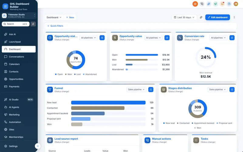
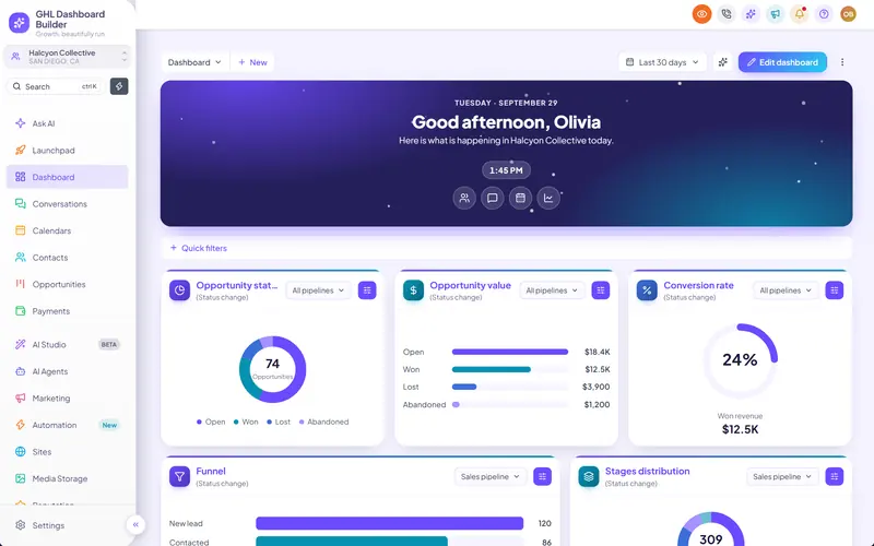
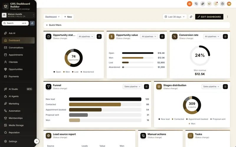
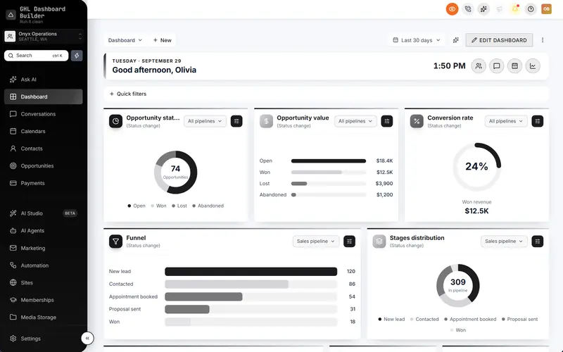
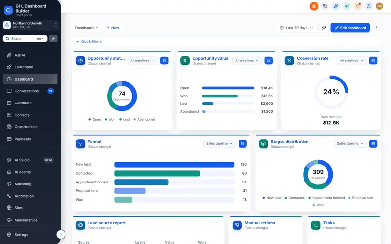
Your clients open the same screen every morning before they see anything else you built: the sign-in page. If it shows a plain card with a small logo on a grey background, it tells them they are logging in to someone else’s software. You want a login page that looks like your own product, in your colors and with your words, without breaking the sign-in your clients depend on.
This guide explains how a GoHighLevel custom login page works in HighLevel (also called GoHighLevel or GHL). It covers where the page is set up, what HighLevel’s own settings change, what needs custom CSS, which design suits which kind of agency, how to set it up step by step with HighLevel’s menu paths, how to keep the form readable and fast, and what a custom login page cannot do. GHL Dashboard Builder is an independent design service and is not affiliated with HighLevel. Where our product helps, we say exactly what it does and which plan includes it: the short version is that our Pro and Agency plans install a branded sign-in page, in one of 25 designs, on your white-label domain.
What is the GoHighLevel login page, and where is it set up?
The GoHighLevel login page your clients use is the sign-in screen on your white-label domain, a subdomain such as app.youragency.com. You set it up in the agency view under Settings, Company. It is one page for your whole agency, and it is the first branded screen a client sees each day.
HighLevel’s help center describes a whitelabel domain as a branded address for the desktop login portal. Without one, your clients sign in on a shared HighLevel address, where your agency name and logo do not appear at all. With one, they sign in at your address and see your agency logo above the form. That is the foundation every custom login page builds on.
Three facts about this page shape everything else in this guide:
- It belongs to the agency, not to a sub-account. The page appears before anyone has signed in, so HighLevel has no way to know which client is visiting. Everyone who uses your white-label domain sees the same sign-in page.
- It is part of the web app. The login page is the front door of the HighLevel app in a browser. HighLevel’s mobile app has its own sign-in screen, which is not affected by anything in this guide.
- The look and the logic are separate. HighLevel runs the password check, security codes and password resets. The look of the page, including the card, the background and the text around the form, is styled by CSS, which is why agencies can change it without touching how sign-in works.
If you have not set up your white-label domain yet, start there. Our step-by-step guide to white-labeling HighLevel covers the domain, logo, email and mobile app settings in order, and this guide picks up from the moment clients can reach your sign-in page.
What can you change on the login page without code?
Without code, HighLevel lets you change three things that affect the login page: the address it lives on, the agency logo it shows, and whether the Sign in with Google option is offered. These are real, supported settings, and they are worth doing first. They do not change the page’s layout, colors, background or text.
HighLevel’s agency company settings article groups these options in the agency’s company settings, with the white-label options in the Whitelabel section. Here is how each one shows up on the sign-in page, at the time of writing.
| HighLevel setting | Where it is | What it changes on the login page |
|---|---|---|
| White-label domain | Agency view: Settings, Company, Whitelabel | The address clients sign in at, such as app.youragency.com |
| Agency logo | Agency view: Settings, Company | The logo shown at the top of the sign-in page |
| Google login for white-label domains | Agency view: Settings, Company, Whitelabel | Whether a Sign in with Google button appears and works on your domain |
| Two-factor authentication | Each user’s profile (My Profile) | Whether users are asked for a security code after their password |
| Custom Code (Custom CSS and Custom JavaScript) | Agency view: Settings, Company, Whitelabel, Custom Code | Nothing until you add code; this is where the page’s design goes |
The Google login option has two conditions worth knowing. HighLevel’s help article on Google login for white-label agencies explains that the toggle only appears once your white-label domain is configured correctly. It also explains that users must choose the Google account that is registered with your agency; choosing another Google account gives a “User does not exist” error. Browsers may also need to allow a pop-up the first time. Those three points explain most of the “Google sign-in does not work” messages agencies receive after launching a new login page.
Two-factor authentication is also handled by HighLevel, not by the page’s design. HighLevel’s article on authenticator app support for two-factor authentication describes adding a time-based one-time password app in the user’s profile, alongside phone and email verification. Your login design will sit in front of that flow; it does not replace it.
What HighLevel’s settings leave unchanged is everything a client actually notices: the layout of the page, the background, the card, the button color, the headline and any line about your product. That is where custom CSS comes in.
What needs custom CSS on the GoHighLevel login page?
Custom CSS changes the look of the page: the background, the layout, the card around the form, the colors of the button and fields, the fonts, and text such as a headline or a footer line. CSS cannot change how sign-in works. Fields, security codes, password resets and Google sign-in stay exactly as HighLevel built them.
The CSS for the login page goes in the same place as the dashboard theme: the agency’s Custom CSS box under Settings, Company, Whitelabel, Custom Code. If you have not used that box before, our guide to where to add GoHighLevel custom CSS and how to roll it back explains the backup routine that makes it safe. The same rules apply here, with one extra twist: a broken login page can stop clients from even reaching the dashboard, so the rollback plan matters more.
Here is what CSS can and cannot do on the sign-in page.
| Part of the login page | Can CSS change it? | Notes |
|---|---|---|
| Background color, gradient or photo | Yes | Photos should be compressed and have an overlay so the form stays readable |
| Layout (centered card, split screen, side panel) | Yes | The form keeps its fields; CSS moves and frames it |
| Card style, corners, shadow and width | Yes | Keep the card wide enough for long email addresses on a phone |
| Button, link and field colors | Yes | Check contrast for text and for field borders |
| Fonts | Yes | Load as few font files as possible; the login page is the first load of the day |
| A headline, subtitle or footer line | Yes, as text written in by CSS | Keep it short; it is decoration, not content search engines or screen readers rely on |
| Showing or hiding the Google button, Forgot password link or terms line | Visually, yes | Hiding is visual only; the HighLevel setting still decides whether Google sign-in is enabled |
| The fields and the sign-in steps | No | HighLevel controls the form, the password check and the flow |
| Security codes, authenticator apps and password resets | No | These stay HighLevel’s own screens and emails |
| Which client is visiting | No | The page is shared by the whole agency |
| The mobile app’s sign-in screen | No | Agency custom code styles the web app only |
The most useful line in that table is the one about hiding. If you hide the Forgot password link with CSS, a client who forgets their password has no obvious way to reset it, and your team gets the support call. If you hide the Google button but leave Google login switched on in HighLevel, the option still exists for anyone who knows where to look. Decide in HighLevel’s settings what should work, then decide in the design what should show.
Writing this CSS by hand is possible, and some agencies do it well. The challenge is the same as with dashboard CSS: HighLevel’s page structure can change between releases, and a rule that targets an element HighLevel renames stops working. Our guide to fixing GoHighLevel custom CSS that is not working explains why that happens and how to write rules that last longer.
How does GHL Dashboard Builder brand the login page?
GHL Dashboard Builder is an independent design service that turns the standard HighLevel (GoHighLevel) dashboard into a branded platform: your colors, menu, login design, privacy mode and your clients’ language, installed with two lines of code. From the Pro plan, the login page is part of that design: you choose one of 25 login designs in your colors, and it installs on your white-label sign-in page.
The login design is not a separate tool or a separate install. It is one section of the same design that brands the dashboard, so the sign-in page and the screens behind it share one set of colors, fonts and button styles. You pick a design, set your colors and text, and the login page installs with the rest of your theme in Custom Code. The page keeps your agency logo and HighLevel’s Platform Language picker, styled to match.
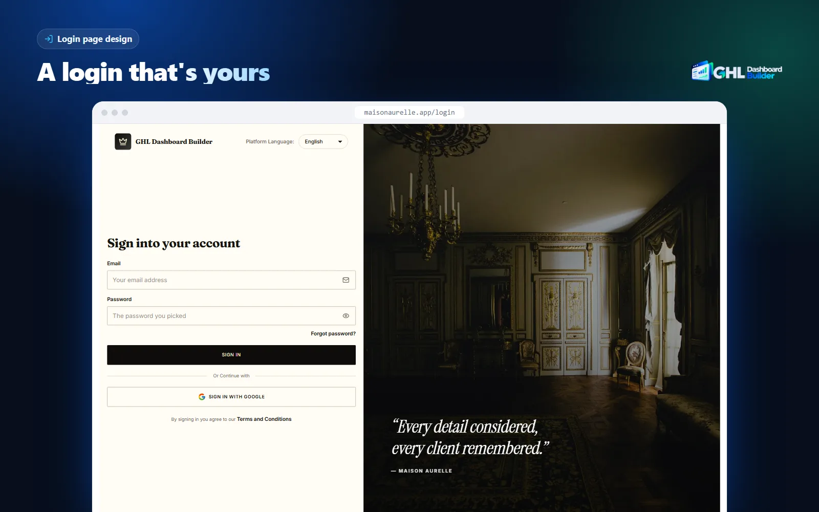
Here is what you can set on the login page, and which plan includes each part.
| Feature | What it does for your agency’s clients | Plan |
|---|---|---|
| 25 login designs | A finished sign-in page, from a clean card and a brand panel to photo splits, a highlights panel and layouts that rearrange the page itself | Pro and Agency |
| Background | A color, a pattern, a photo with your own overlay strength, or a gradient: linear, oval, circle or color wheel, with 2 to 5 colors | Pro and Agency |
| Your logo | The agency logo HighLevel already shows, sized and placed for the design | Pro and Agency |
| Headline and text | Your own headline, subtitle and footer line around the sign-in form | Pro and Agency |
| What to show | Show or hide the Google button, the forgot-password link and the terms line | Pro and Agency |
| Language picker | HighLevel’s Platform Language picker stays, styled to match the design | Pro and Agency |
| Brand colors and fonts | The same colors and fonts on the dashboard behind the login page | Starter and up |
| Live preview | The login page and the dashboard shown on desktop, tablet and phone before anything is installed | Starter and up |
| Installation | We install the design in your HighLevel, configure it and check every screen | All plans, one-time $100 setup fee |
What the client sees afterwards is simple: they open your address, see a sign-in page in your colors with your logo and a line about your service, sign in exactly as before, and land on a dashboard in the same style. Sign-in, two-factor codes and password resets still work as HighLevel built them, because the design only changes how the page looks.
Infographic
The branded login pageby the numbers
25
login designs, each in your own colors
(GHL Dashboard Builder)
4
gradient shapes for the background: linear, oval, circle, color wheel
(GHL Dashboard Builder)
2–5
colors in a background gradient you design
(GHL Dashboard Builder)
$480
one-time Pro plan that includes the login page, plus a $100 setup fee
(GHL Dashboard Builder pricing)
Source: GHL Dashboard Builder product and pricing pages, November 2026.

One plan detail to be clear about: Starter ($280) brands the dashboard, but keeps HighLevel’s standard sign-in page with your logo. The login design starts at Pro ($480), and Agency ($880) includes it too. All three are one-time payments with no monthly fee, plus a one-time $100 setup fee. The GoHighLevel login page customization page shows real renders of the designs, and the features page shows how the login page fits with the other 17 features.
Which login page design suits your agency?
Choose the design by what your clients need to feel when they sign in: calm and trustworthy, energetic, premium or practical. A clean card suits professional services, a brand panel suits agencies with a strong message, a photo layout suits visual businesses, and a gradient suits agencies that want color without a heavy image.
It helps to think of login designs in families rather than as 25 separate choices. Each family solves a different problem.
Card designs put the sign-in form in a card on a calm background. Clean card, Midnight, Minimal and Soft gradient belong here. They are the safest choice for clinics, law firms and financial services, where clients want to feel that nothing has changed except the brand. They also load fastest and are the easiest to keep readable.
Panel designs split the screen: the form on one side, your message on the other. Brand panel shows your headline in a bold panel, and Highlights panel lists three reasons to sign in, in your color. These suit agencies that sell a named product, such as a SaaS-mode reseller with a platform name, because the panel tells clients what the product does for them every morning.
Photo designs use a picture as the main element: Photo split, Editorial, Full photo, Frosted photo, Photo wall and Cover photo. They suit businesses where the picture carries the brand, such as real estate, hospitality, beauty and fitness. The trade-off is weight and readability, which the next sections cover.
Shape and scene designs use color and movement instead of a photo: Floating shapes, Horizon and the gradient backgrounds. They give a modern, product-like feel without the file size of a photo.
Layout designs rearrange HighLevel’s sign-in page itself: Overlap band, Inline bar, Edge column, Magazine, Three columns, Arch, Diagonal, Pass card, Open page, App window and Card stack. These make the page look least like a standard sign-in screen, which is the point for agencies that want clients to forget which platform runs underneath.
| If your agency… | Start with | Why |
|---|---|---|
| Serves clinics, law firms or accountants | Clean card or Minimal | Calm, familiar and fast; the brand color does the work |
| Sells HighLevel as a named SaaS product | Brand panel or Highlights panel | The panel states what the product does each time customers sign in |
| Serves visual businesses (real estate, spas, gyms) | Photo split or Editorial | A photo carries the industry better than any color |
| Wants a modern, product feel without photos | Soft gradient or Floating shapes | Color and depth with a small file size |
| Wants the page to stop looking like a standard login | A layout design such as Arch or App window | The page structure itself changes, not only the colors |
| Has clients who sign in mostly on phones | A card design | Fewer elements to fit on a small screen |
Two pieces of advice apply to every family. First, match the login page to the dashboard behind it. A dark, dramatic login page in front of a light, pastel dashboard feels like two products. Starting from a finished dashboard template, such as the deep violet Monarch template, and then choosing a login design in the same palette keeps the two in step. The templates gallery has 27 dashboard designs to start from.
Second, be careful with quotes. Some photo and panel designs show a short line of text beside the form, and it is tempting to fill it with a glowing client quote. Use brand messages your business stands behind (“Every lead, call and booking in one place”) rather than words of praise you cannot attribute to a real, consenting client. A sign-in page is not the place for an unverifiable claim.
Gradients deserve a special mention, because they are the best balance of color and speed. A gradient is drawn by the browser from a few color values, so it adds almost nothing to the page’s size, and it scales to any screen without blurring.
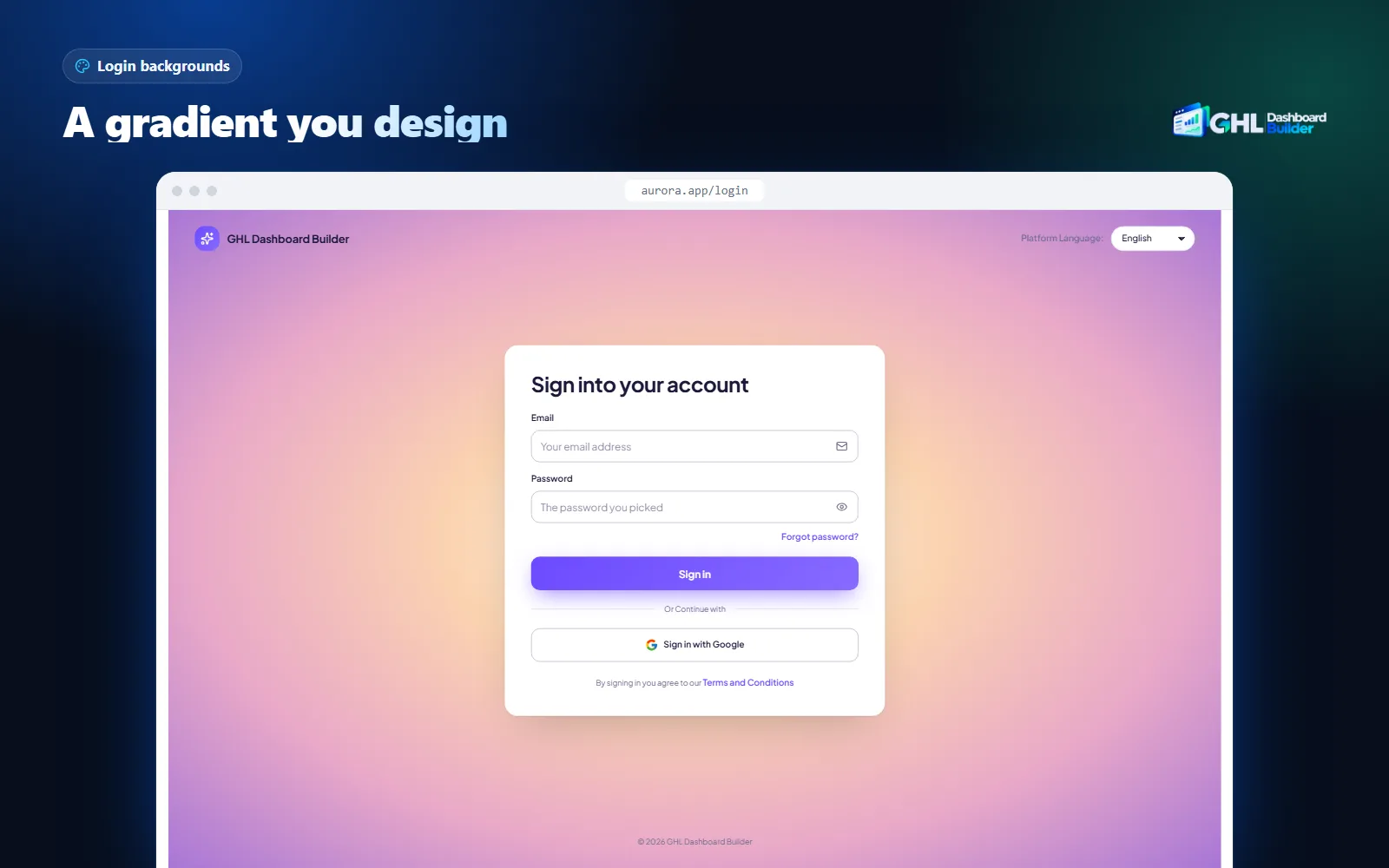
Our login designs let you build that gradient yourself: linear, oval, circle or color wheel, with 2 to 5 colors, set from your brand palette. If you are not sure which colors to use, pick the gradient from the same primary and accent colors the dashboard uses, so the sign-in page and the first screen after it feel like one product.
How do you set up a GoHighLevel custom login page step by step?
Set up the white-label domain, add your agency logo, decide on Google sign-in, choose and preview a design, install the CSS in Custom Code, then test the page signed out, on a phone and with a real user. The domain takes the longest because DNS has to update; the design and install take minutes.
Infographic
A GoHighLevel custom login pagein six steps
- 1
Set the domain
Add a white-label subdomain such as app.youragency.com.
- 2
Add your logo
Upload the agency logo in Settings, Company.
- 3
Decide on Google
Switch Google login on or off in Whitelabel.
- 4
Pick a design
Choose a layout, colors and a short headline.
- 5
Install the code
Paste the CSS into Custom Code after a backup.
- 6
Test signed out
Open a private window and a phone, then sign in.

Menu paths below follow HighLevel’s help center at the time of writing. HighLevel moves settings from time to time; if a label differs in your account, search the help center for the setting’s name.
1. Set up the white-label domain
- Choose a subdomain of a domain you own, such as
app.youragency.com. HighLevel’s article describes the white-label domain as a subdomain; use a short, memorable one because clients will type and bookmark it. - In the agency view, open Settings, then Company, then the Whitelabel section, and find the white-label domain field.
- Enter the full subdomain.
- At your DNS provider, create the CNAME record HighLevel’s white-label domain article specifies. Copy the target value from HighLevel’s current article or settings screen rather than from an old guide, because third-party guides list different values.
- Wait for DNS to update, then open the subdomain in a private window and confirm the sign-in page loads over a secure connection.
2. Add your agency logo
- In the agency view, open Settings, then Company.
- Upload your logo. A logo with a transparent background works on both light and dark login designs.
- Open your white-label domain in a private window and check the logo’s size and sharpness.
If you plan a dark login page, check that the logo still reads on a dark background. Many agencies keep a light version of the logo for exactly this case.
3. Decide on Google sign-in
- In the agency view, open Settings, Company, Whitelabel.
- Find the Google login option. It appears only once the white-label domain is configured correctly.
- Turn it on if your clients use Google accounts for work, or leave it off if you want every user on email, password and two-factor codes.
- If you turn it on, tell clients to choose the Google account registered with your agency, and to allow the pop-up the first time.
4. Choose and preview the design
- Decide what the page should say in one short line, such as “Bookings, reminders and reviews in one place”.
- Choose a design family from the previous section, in your brand colors.
- Preview it on desktop, tablet and phone before anything is installed.
- Check that the Forgot password link, the terms line and the Google button are shown or hidden the way you decided in step 3.
The free builder is the quickest way to try this: it shows your colors, logo, menu wording and language on a live copy of HighLevel’s screens, and never connects to your HighLevel account.
5. Install the code
- In the agency view, open Settings, Company, Whitelabel, Custom Code.
- Copy whatever is in Custom CSS and Custom JavaScript into a text file named with today’s date. That file is your rollback.
- Paste the login page CSS (or your theme’s install lines) and save.
- With GHL Dashboard Builder, the login design installs with the rest of your theme, and on every plan we do this step for you as part of the one-time $100 setup fee.
6. Test the page as a client would
- Sign out, or open a private window, and load your white-label domain. A normal refresh can show a cached old version; use Ctrl+Shift+R (Cmd+Shift+R on a Mac).
- Sign in with a password, then with Google if it is enabled, then with a user who has two-factor authentication.
- Use the Forgot password link and confirm the reset flow starts.
- Open the page on a phone in portrait and landscape, and check that the form is not cut off.
- Ask one friendly client to sign in the next morning and tell you what they notice.
How do you keep a custom login page readable and fast?
Keep enough contrast between the form and whatever sits behind it, keep the background light in file size, and keep the text short. The W3C’s contrast guidance sets a 4.5 to 1 minimum for normal text, its non-text rule asks for 3 to 1 for field borders, and web.dev treats a main element that takes over 2.5 seconds to show as slower than it should be.
Contrast first. The W3C’s Contrast (Minimum) criterion sets a ratio of at least 4.5 to 1 for normal text and 3 to 1 for large text. Field labels, the Forgot password link and the terms line on a sign-in page are small, so 4.5 to 1 is the target. The W3C’s Non-text Contrast criterion asks for 3 to 1 for the visual parts of controls, which on a login page means the borders of the email and password fields. A pale field border on a white card is the most common failure on branded sign-in pages: the page looks clean, but clients cannot see where to click.
Source: W3C WCAG 2.2 Understanding 1.4.3 Contrast (Minimum) and 1.4.11 Non-text Contrast.
Photos make contrast harder, because a photo has light and dark areas and the form may sit over both. Three habits keep a photo layout readable:
- Use an overlay. A semi-transparent dark or light layer over the photo evens out its tones. Our photo layouts include an overlay with a strength you set, so you can raise it until the text passes.
- Keep the form on a card. A solid or frosted card behind the fields gives the text a predictable background, whatever the photo does.
- Check the busiest part. Look at the form where it overlaps the most detailed part of the image, not where it looks best.
Speed second. The sign-in page is often the first thing a client loads in the morning, on a phone over mobile data. web.dev’s guide to Largest Contentful Paint says sites should aim for the main content to appear within 2.5 seconds, and treats more than 4 seconds as poor. The same guide notes that an element with a background image loaded with CSS’s url() can be the page’s largest element, while a CSS gradient does not count as one. In plain terms: a large background photo can be what clients wait for, and a gradient will not be.
So, if you use a photo, compress it and size it for screens rather than print. If speed on phones matters more than the picture, use a gradient or a card design instead. Load one font family at most, because every extra font file is another wait before the text appears.
Short text third. One headline and one short line beneath it are enough. A paragraph beside the form is rarely read, it crowds the screen on phones, and it is one more thing to translate if your clients work in another language. Text that CSS writes onto the page is decoration: it is not read by every screen reader in the way normal page text is, so never put instructions clients must read (such as “use your work email”) only in a decorative headline. Put important instructions in your welcome email too.
Can each client see a different login page?
No, not on one white-label domain. The login page appears before anyone signs in, so HighLevel cannot know which client is visiting, and every user of your domain sees the same sign-in page. After sign-in, the dashboard can look different for chosen sub-accounts, which is where per-client branding actually lives.
This is the question agencies ask most about login pages, and the honest answer saves you from promising something that cannot work. HighLevel keeps the white-label domain and its sign-in page at agency level. Our own help pages say the same about our designs: the login page is shared by your whole agency, so every client sees the same branded sign-in screen.
What you can do per client is everything after the sign-in. A GHL Dashboard Builder design can apply to the whole agency or only to sub-accounts you choose, by link or Location ID, from the same single install. So a premium client can sign in on your agency’s branded page and land on a dashboard in their own colors, while your other clients keep the agency look. Starter includes 1 design, Pro up to 3 and Agency up to 100, each for the whole agency or chosen sub-accounts. Our guide to GHL sub-account branding explains how the scope works and its edge cases, and our guide to agency versus sub-account settings shows which branding settings live at which level.
| What you want | Possible from one white-label domain? | How |
|---|---|---|
| One branded sign-in page for all clients | Yes | One login design installed in the agency’s Custom Code |
| A different dashboard look for one client after sign-in | Yes | Limit a design to that client’s sub-account by link or Location ID |
| A different sign-in page for each client | No | The page appears before sign-in, so it cannot know the client |
| Separate brands, each with its own domain and sign-in page | Not from one agency domain | Talk to HighLevel about its options for separate brands, and to us about the designs |
If you run several brands, for example one for dental clients and one for home services, plan the domains before the designs. Choose the sign-in page that works for every client on a domain, usually your agency brand, and put the industry branding on the dashboard behind it, where a client-specific look is possible. If you need different looks for many clients, talk to us about the setup before you buy.
What about clients who work in another language?
The login page keeps HighLevel’s Platform Language picker, so clients can switch HighLevel’s language before they sign in. Your headline and footer line are your own text, so write them in your clients’ language. For Arabic, Urdu and Hebrew, the dashboard behind the login page can also switch to right-to-left.
A login page in the wrong language is a small thing that clients notice every day. If your clients work in Spanish, French or German, write the headline in that language, and keep it short so it fits the design on a phone. HighLevel’s own labels on the form, such as the field names and buttons, follow HighLevel’s language settings rather than your design, which is why the Platform Language picker stays on every one of our login designs.
For right-to-left languages, test the page in the client’s language before you launch. Arabic, Urdu and Hebrew read from right to left, so a headline that sits neatly beside the form in English can look misplaced once the text direction changes. Behind the login page, our language feature translates the dashboard’s menu and navigation into 15 languages, with right-to-left layout for Arabic, Urdu and Hebrew and your own wording for any label. Text inside HighLevel’s own pages, builders, system emails and the mobile app follows HighLevel’s language settings. The languages page lists all 15, and our guide to a HighLevel Arabic dashboard shows a right-to-left setup from start to finish.
What can go wrong with a custom login page?
The common problems are a domain that does not load, a design that hides something clients need, a page that is hard to read on phones, Google sign-in errors, and CSS that stops working after a HighLevel update. Each one has a simple check, and the backup you made before installing turns any of them into a quick rollback.
Work through these in order when something looks wrong.
| What you see | Likely cause | What to do |
|---|---|---|
| The white-label domain does not load | The DNS record is missing, mistyped or not yet updated | Check the CNAME record against HighLevel’s article, wait, then test in a private window |
| The old design still shows | Browser cache | Hard-refresh with Ctrl+Shift+R or Cmd+Shift+R, or open a private window |
| No Google sign-in toggle in HighLevel | The white-label domain is not configured correctly yet | Finish the domain setup first; the toggle appears afterwards |
| “User does not exist” after Sign in with Google | The client chose a Google account that is not registered with your agency | Ask them to choose the Google account registered with you |
| Clients cannot reset their password | The Forgot password link was hidden in the design | Show the link again |
| The form is cut off or crowded on phones | A wide card, a long headline or a side panel on a small screen | Use a card design or shorten the text, then check portrait and landscape |
| Text or field borders are hard to see | Low contrast over a photo or gradient | Raise the overlay, darken the text or strengthen the field borders |
| The design breaks after a HighLevel release | HighLevel changed the sign-in page’s structure | Roll back to your saved code, then update the CSS or the theme |
| Pages stall after the install | Custom code conflicting with HighLevel’s loader | Test in a private window; if that loads, roll back and fix the code |
The last row comes from HighLevel’s own help center. Its article on CRM loading states and the impact of custom CSS and JS names custom code as a possible cause of loading problems and recommends testing in a private window, then clearing site data and hard-refreshing.
There are also limits that no design removes, and it is better to know them before you promise clients anything:
- HighLevel does not officially support custom code. HighLevel describes custom CSS and JavaScript as unsupported, and a large HighLevel update can change the sign-in page enough to need a refresh of the design. Our plans include 12 months of updates that cover this (lifetime on Agency), then optional updates at $99 a year; without them the design keeps working as it is.
- The mobile app is separate. Clients who sign in through HighLevel’s mobile app do not see your web login page.
- System emails are separate. Password reset and security code emails follow HighLevel’s templates and your email settings, not your login design.
- Other login screens are separate. Client portals, membership areas and funnels have their own domains and settings. This guide is about the agency app’s sign-in page.
- The page cannot change the sign-in steps. You cannot add fields, remove two-factor authentication or change the order of steps with CSS. Those are HighLevel’s decisions, made in HighLevel’s settings.
Custom login page options compared: by hand, add-ons or a full theme?
There are three common ways to get a GoHighLevel custom login page: write the CSS yourself or hire a developer, use a separate login page tool, or install a login design as part of a full dashboard theme. Writing it yourself costs time and upkeep; separate tools may not match the dashboard; a full theme keeps both in one design.
Each route makes sense for someone. The question is who maintains the page after HighLevel’s next release, and whether the sign-in page and the dashboard behind it look like the same product.
| Question | CSS by hand or a developer | A separate login page tool | Login design in a full theme (GHL Dashboard Builder) |
|---|---|---|---|
| Coding needed | Yes | Usually no | No |
| Matches the dashboard behind it | Only if you style both | Separate design, separate install | Same design, same install |
| Preview before installing | Rarely | Varies | Yes, on desktop, tablet and phone |
| Ready-made designs | None, you start blank | Varies | 25 |
| Upkeep after HighLevel changes | You or the developer, per fix | Depends on the provider | 12 months included, lifetime on Agency |
| Cost model | Your time or hourly rates | Depends on the provider | One-time: Pro $480 or Agency $880, plus a $100 setup fee |
If you already have a developer who maintains your dashboard CSS, adding the login page to their work is reasonable, as long as they keep the code in version control and test after HighLevel releases. If you want the sign-in page and the dashboard designed together, with someone else keeping both working, a full theme is the simpler route. Our GoHighLevel white label dashboard page explains how the login page fits into the full white-label look, and the hub guide to GoHighLevel dashboard customization covers everything else a theme can change.
Our plans are one-time payments with no monthly fees: Starter $280 for 1 design, Pro $480 for up to 3 designs with the menu editor, login page and 15 languages, and Agency $880 for up to 100 designs, a look designed by our team, your own custom code and lifetime updates. Every plan adds a one-time $100 setup fee, for which we install and configure the design in your HighLevel and check every screen. The pricing page lists everything in each plan, and the FAQ answers the common install questions.
What to do next
- Check your domain. Open your white-label domain in a private window today. If clients still sign in on a shared HighLevel address, set up the subdomain first; nothing else on this list matters without it.
- Decide what should work. In Settings, Company, Whitelabel, decide whether Google sign-in is on, and make sure your team uses two-factor authentication.
- Back up your Custom Code. Copy both Custom Code boxes into a dated file before you change anything, so a broken login page is a one-minute rollback.
- Write one line. Write the headline clients will see every morning, in their language, in under ten words.
- Preview before you install. Try your colors, logo and language in the free builder, pick the login design that matches, and test it signed out on a phone before your clients see it.